Mobex

Mobex branding on a screen
Lorem, ipsum dolor sit amet consectetur adipisicing elit. Maiores tempore ipsum perspiciatis aspernatur expedita exercitationem impedit.
Gareth Davies | CEO & Managing Director

Services

Since 2020, Mobex has scaled from a startup to a powerhouse with 350k+ registered users and having delivered over 1k+ webinars. We matured their monochrome identity into a sophisticated, modern system—balancing fresh resonance with the hard-won brand equity they’ve built.

Services we provided…

  • Brand design
  • Web

Challenge & solution

The challenge

Balancing recognition with reinvention

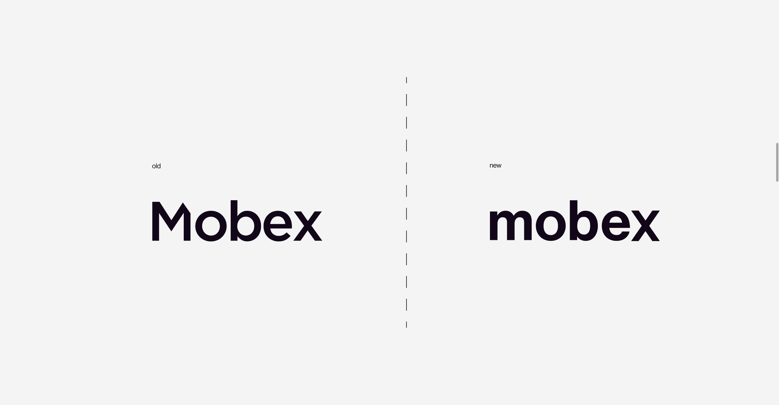
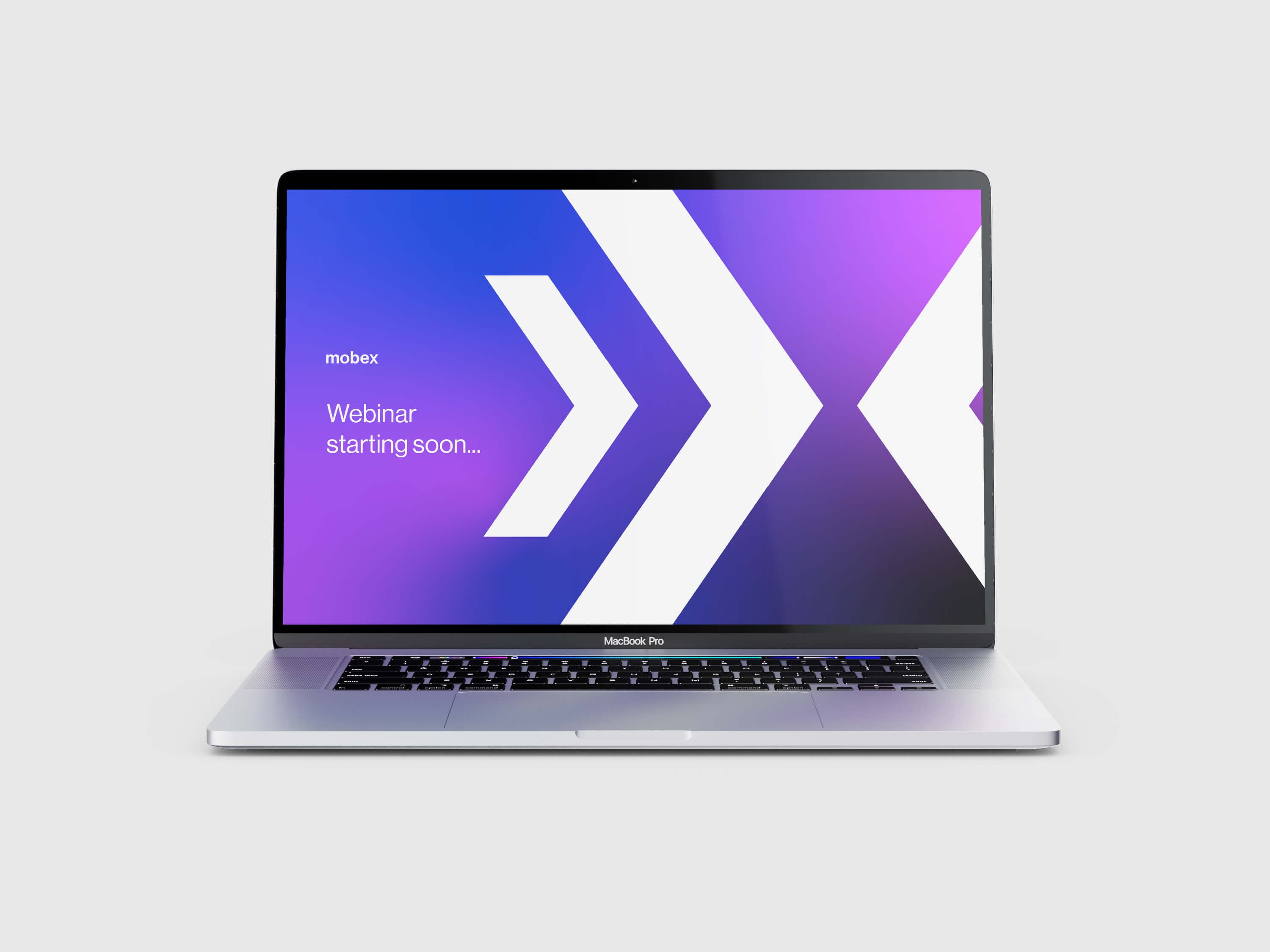
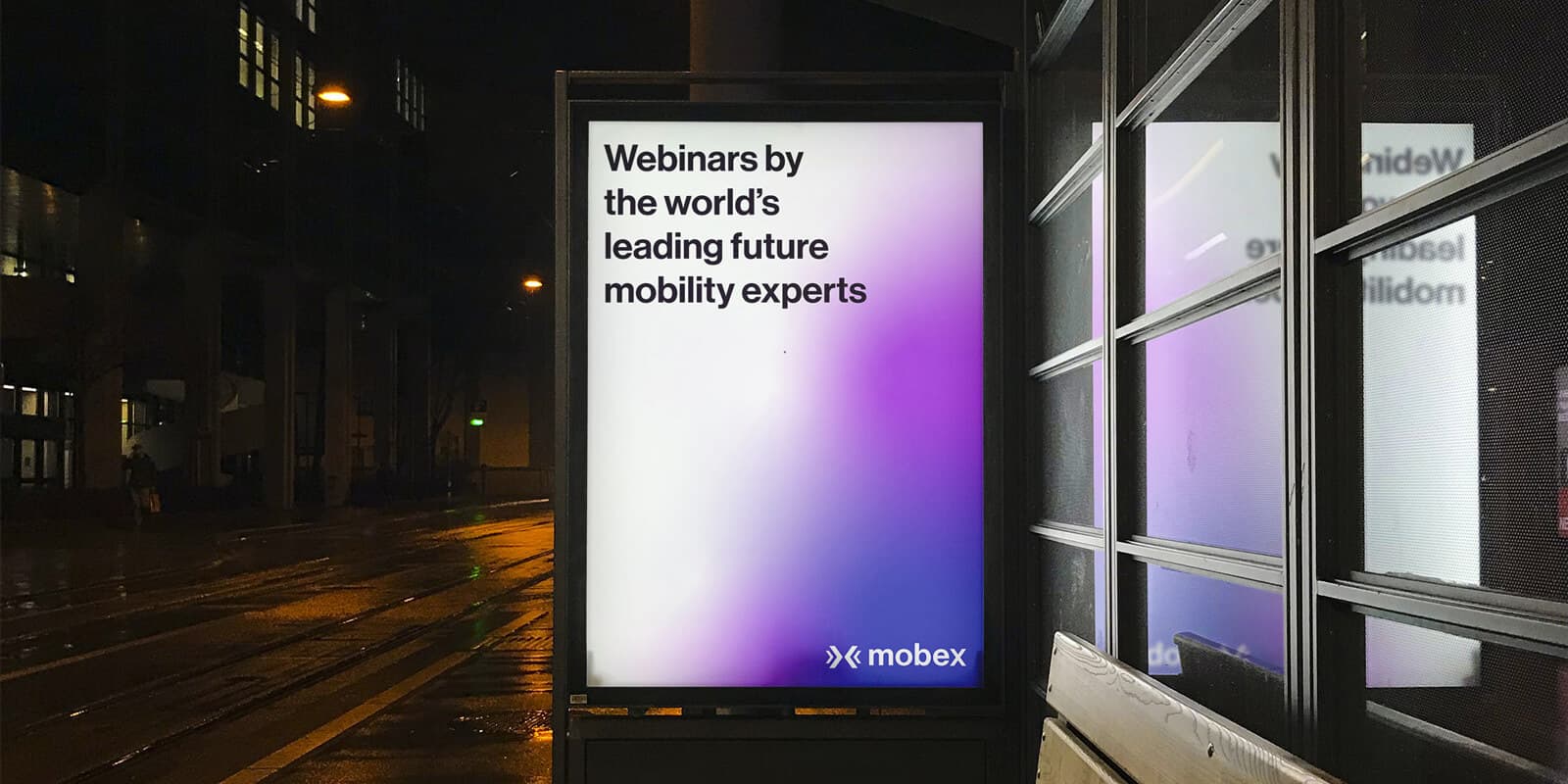
The existing Mobex identity felt static and overly corporate. The challenge was to introduce a vibrant, modern energy—moving away from a rigid monochrome palette—without alienating the existing community. We needed to create a "grown-up" digital presence that stood out in a saturated tech market while remaining inherently welcoming.

The solution

A refined, high-performance visual ecosystem

We transitioned Mobex into a more striking, contemporary space. By softening the logo and introducing a dynamic color secondary system, we gave the brand the flexibility it needed to thrive across multiple digital touchpoints. The result is a fresh, "digital-native" identity that validates Mobex’s success and prepares them for their next phase of global growth.

Mobex new branding

The lowercase logic

The evolution began with the logo mark. We moved to a lowercase 'm' and removed the internal cuts of the letterform to create a softer, more fluid silhouette. This subtle shift significantly altered the brand’s "temperature," moving it from a stiff, transactional feel to an approachable, user-centric identity.

Comparison of Mobex old and new branding
Mobex Ident 1
Mobex Ident 2
Mobex Ident 3

To support the refined logo, we developed a dynamic ident designed to breathe new life into the brand’s digital presence. This wasn’t merely an aesthetic upgrade; it was a strategic functional choice. By creating a flexible visual mark, we’ve ensured the Mobex identity remains agile and high-impact across diverse digital touchpoints, from platform headers to social media assets.

For a brand centered on communication, typography is a cornerstone. We selected Neue Haas Grotesk for its authoritative yet neutral character. This heavy-duty sans serif provides the necessary legibility for high-density digital environments, pairing perfectly with the geometric bold symbol to give key marketing messages a sense of weight and reliability.

Mobex font example

Dynamic visual language

We introduced a palette of bold, fresh gradients to move the brand beyond the constraints of its original monochrome roots. These gradients provide the visual variety necessary to keep the brand "alive" and engaging across a complex platform without becoming repetitive. This vibrant system ensures that Mobex stays instantly recognisable while offering the creative flexibility needed for long-term global growth.

Mobex colour palette
Mobex billboard example
Mobex business card
Mobex webinar holding screen
Mobex bus stop advertisement example

Accessibility-first digital application

For a platform hosting a quarter of a million users, accessibility is a commercial imperative, not an afterthought. We placed usability at the forefront of the UI design, optimising the webinar sign-up flow to be friction-free. The new identity ensures that clear navigation and inclusive design are baked into every pixel of the Mobex experience.

Loading...
Mobex website homepage
Mobex website webinars page

Get in touch

Want to transform your brand? Let's talk!

hello@wearecore.co.uk