Loading...
Beacon Park Boats | Web
24% increase in website bookings
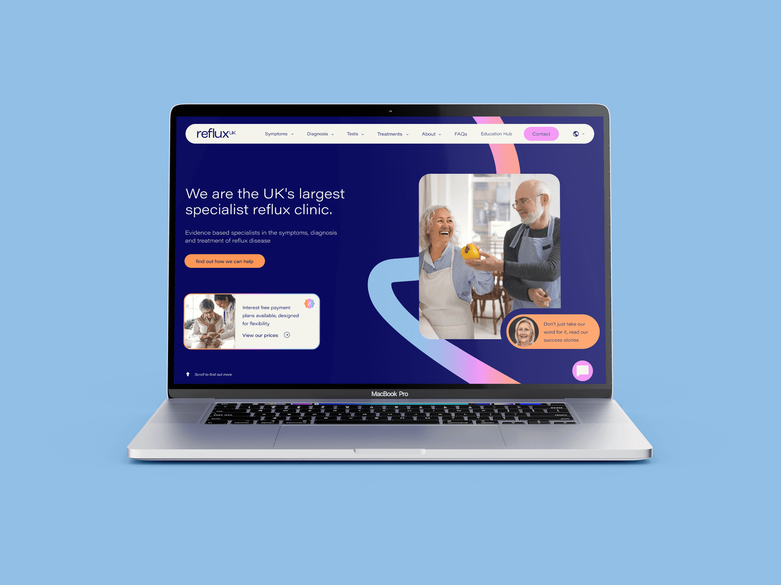
Changing the narrative for the UK's largest reflux specialists
Our new brand identity and website allows us to showcase the best that RefluxUK has to offer to our patients.
RefluxUK are the UK's largest specialist reflux clinic. However, they were aware the best time to further strengthen your position is from an existing position of strength.
This led to discussions around future growth strategy / market position and how CORE could help to deliver this vision for scale.
Develop a brand that stands out in the market and embues the ethos behind RefluxUK and their treatments.
Create a design system that supports RefluxUK's growth strategy whilst ensuring it works seamlessly across all digital and print materials.
Unify the design across all assets to improve consistency and appeal to their future target market, while remaining a strong entity for their current market.
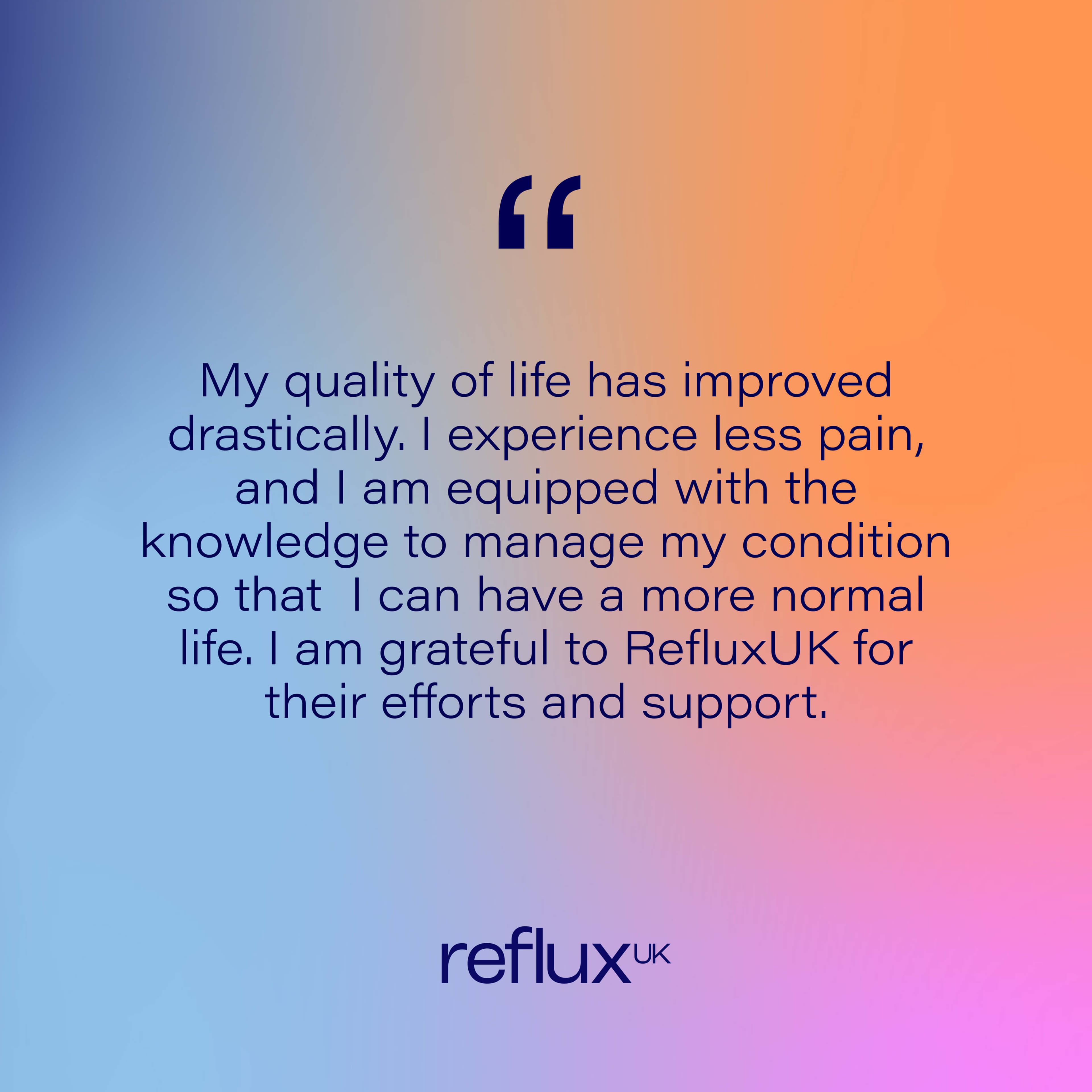
Change the brand narrative to have a more outcome-based focus for the user - mirroring and responding to the concerns of the user.
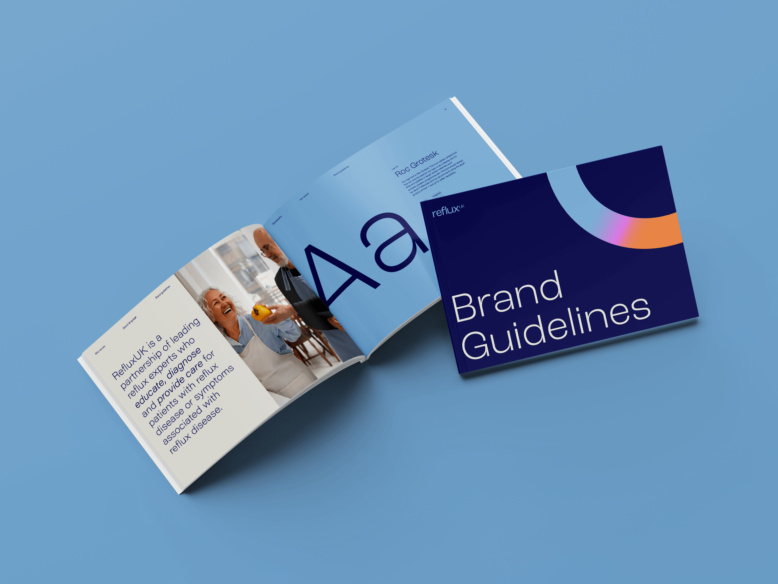
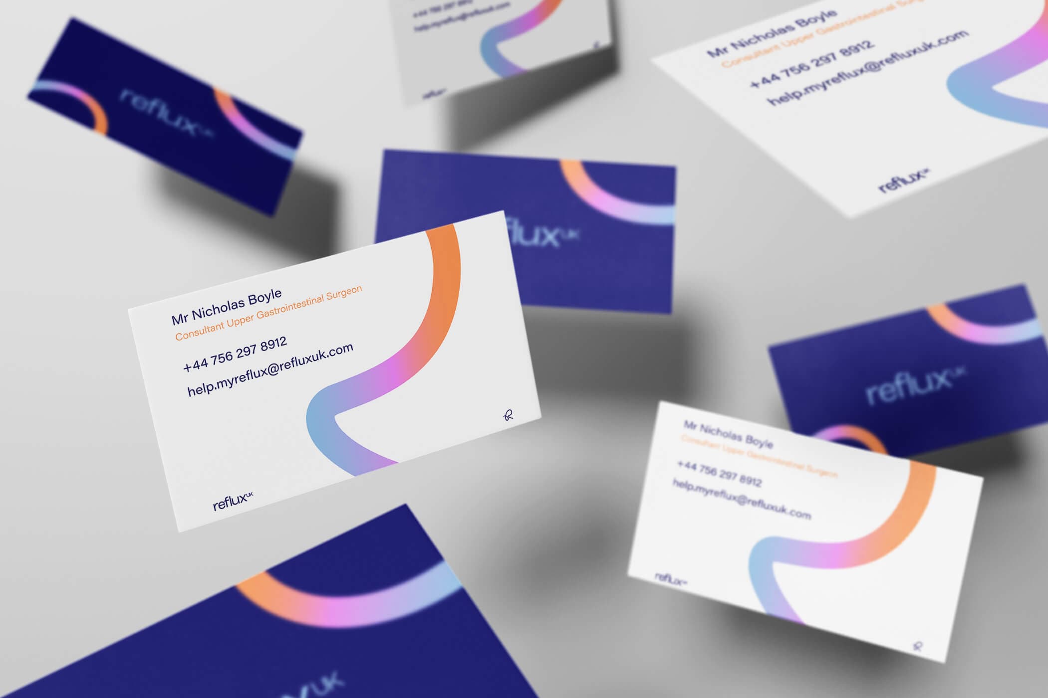
The existing logo mark was dated and had poor usability and readability with its negative space design. The new typographic mark meant a cleaner, contemporary and more refined logo that could be used in various brand colours and applications.
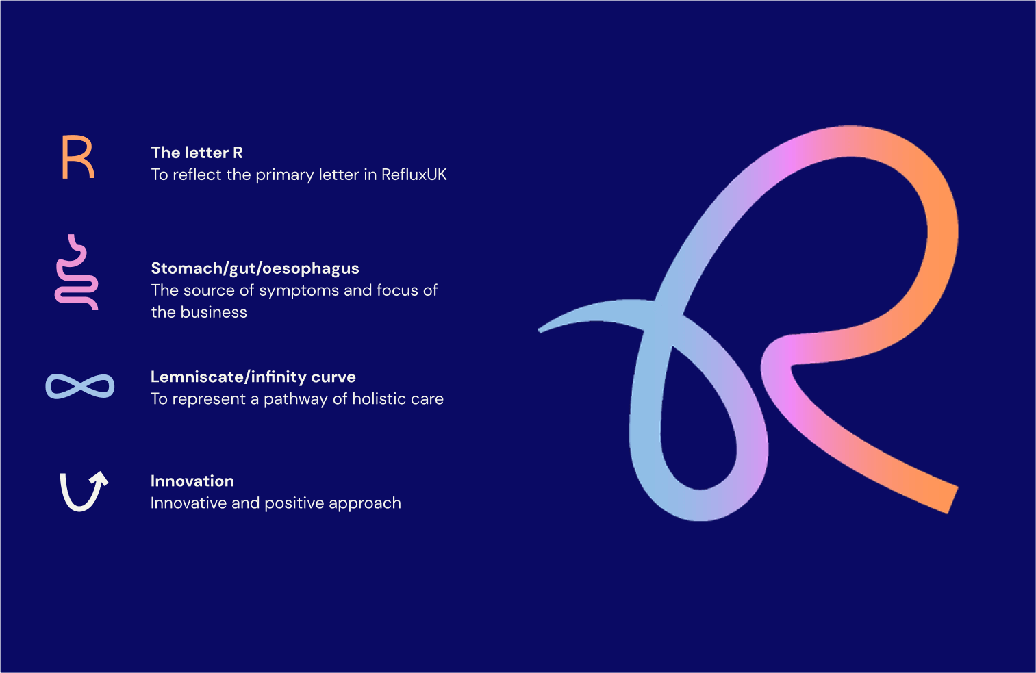
We created a recognisable brand mark that was inspired by four key elements that formed the unique symbol mark, nodding to the ethos and values behind RefluxUK's business model, and their future goals. The logo mark doubles up as a brand device that can be cut in various shapes to allow for flexibility within brand materials.


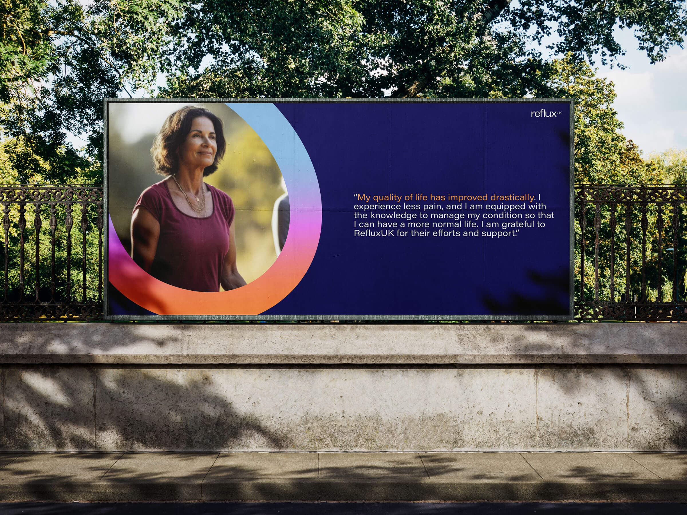
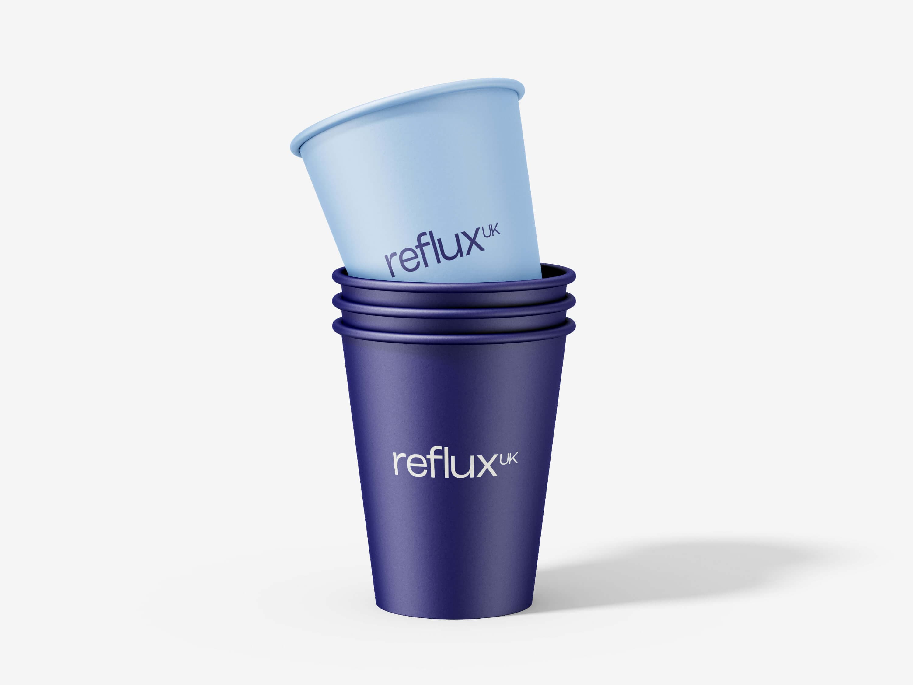
We ditched the dull grey/blue muted tones and embraced a vibrant, future-friendly colour scheme. Paired with a strong geometric typeface and image bank that gives the brand a friendly and approachable look and feel.
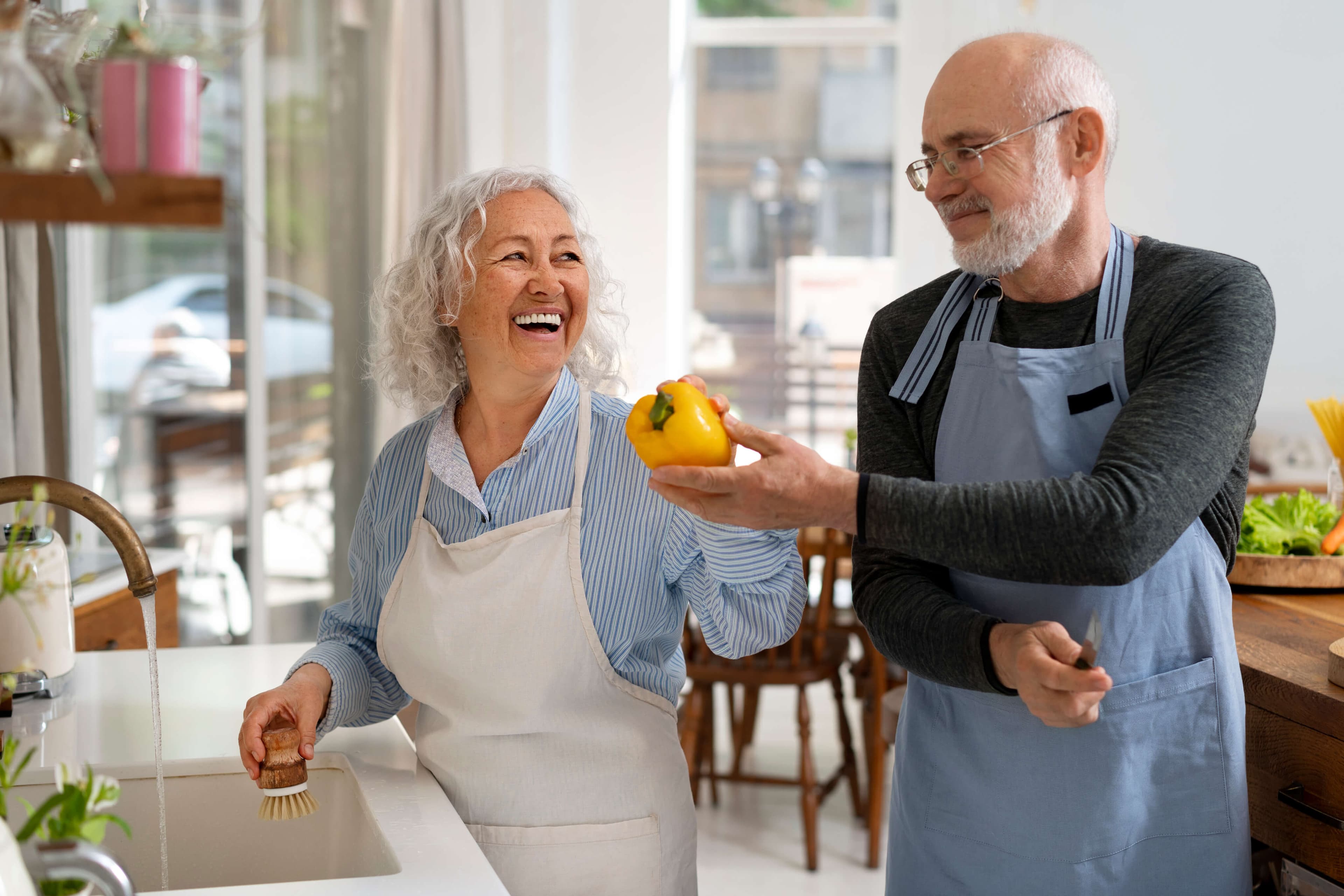
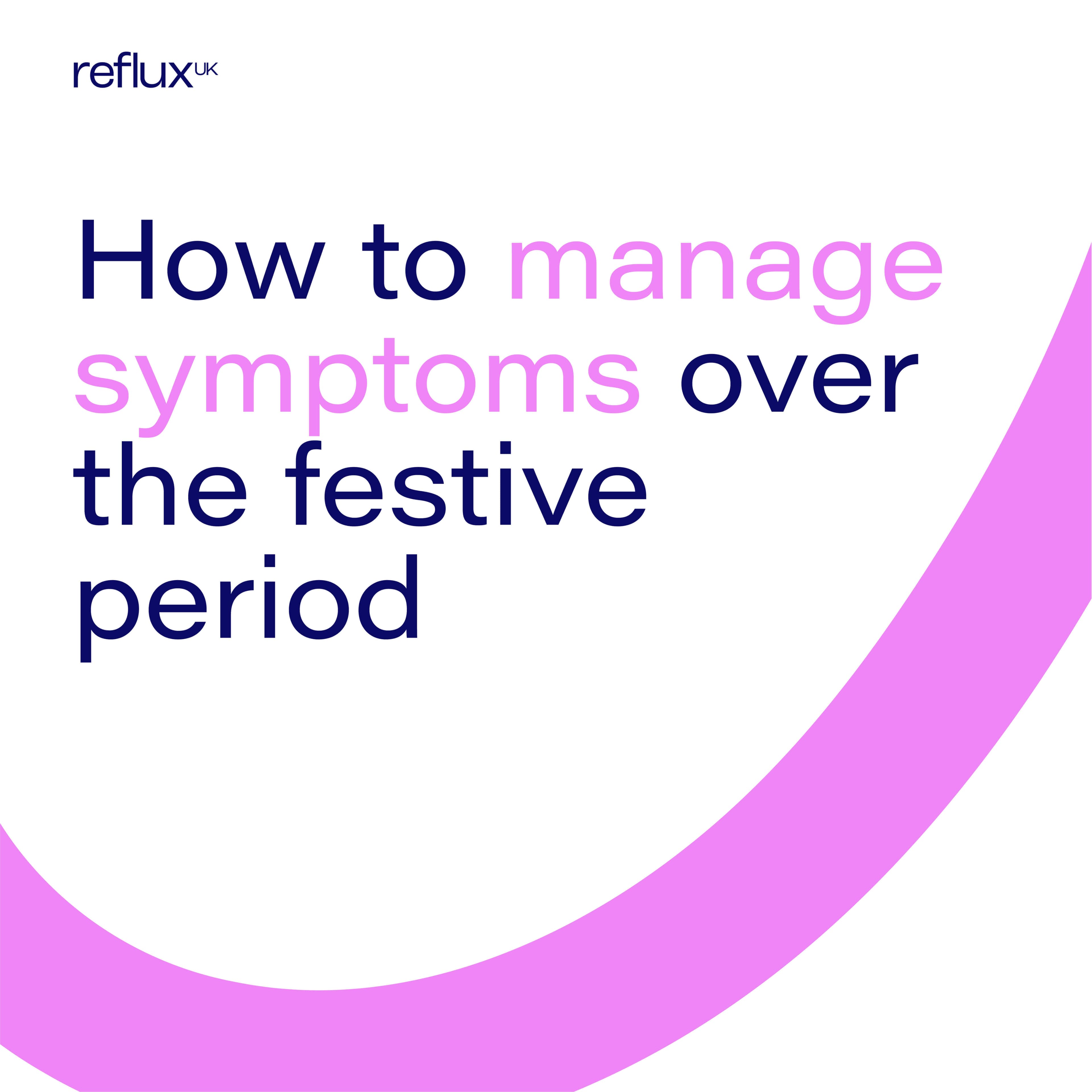

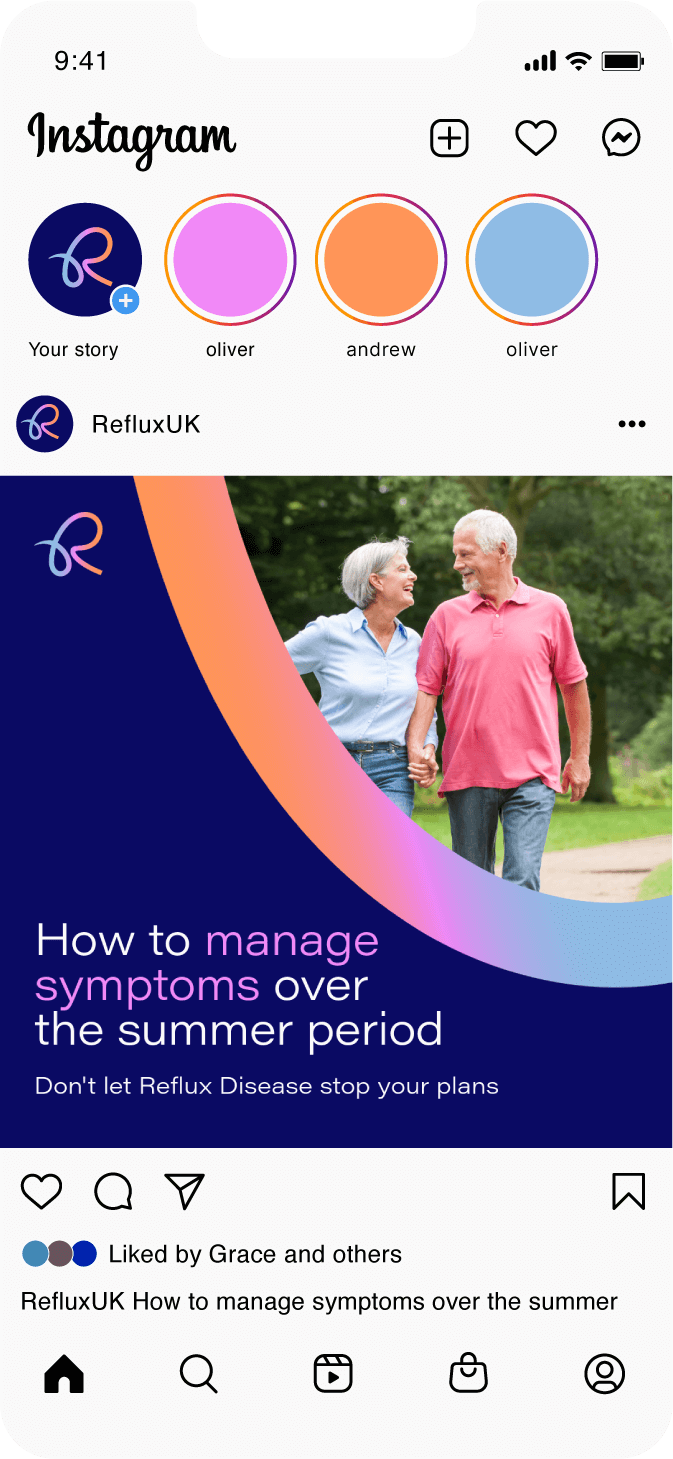
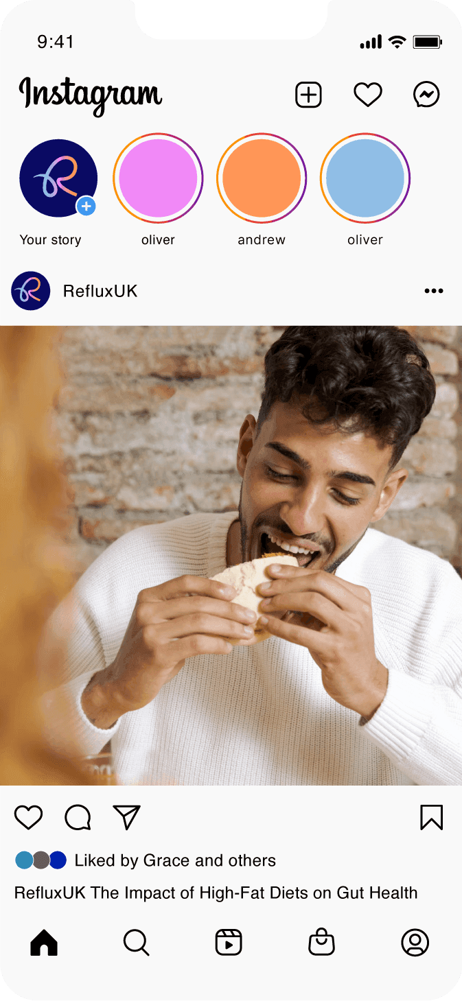
Changing the narrative. We switched up the brand direction and took a step away from surgical imagery and people in pain and replaced these with more light-hearted, joyful imagery to reflect how a person would feel following treatment with RefluxUK.
A selection of projects across web, brand design and digital marketing.

